5 fresh new wall colours for spring
Looking for a quick way to update your space? Be inspired by these new paint colours our Instagram audience are loving
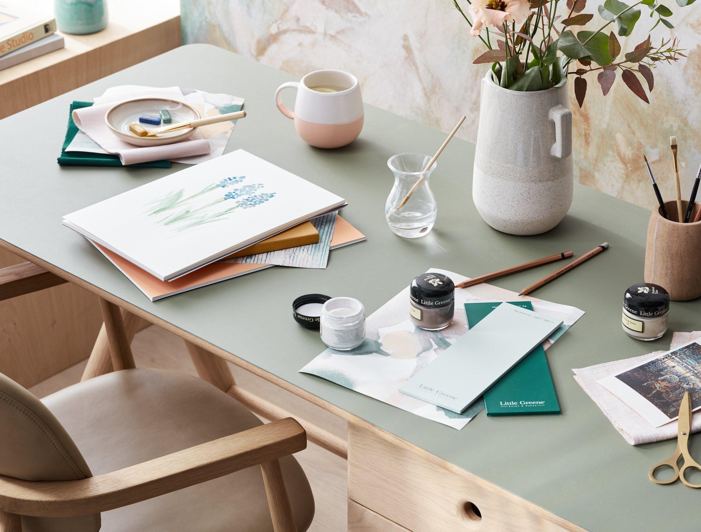
Are you one of the many working from home and staring down a tasteful yet, now you’re confronted by it every day, rather grey wall? If you’ve suddenly taken to wondering how your space might look a bit different, perhaps benefiting from a brighter hue, you’re not alone. In the last few weeks, our homes have become our work spaces, where we stay in for dinner, brunch and everything in between. They’re also hubs of crafting and learning as many attempt to home school and entertain little ones.
All of this means our living spaces are now under the kind of scrutiny that comes from being indoors for long stretches of time without the distraction of workplaces, commutes and our usual daily lives.
Allow us to inspire you. Below you’ll find a clutch of new, spring-fresh paint colours that would tempt even a die-hard minimalist to try something more bold.
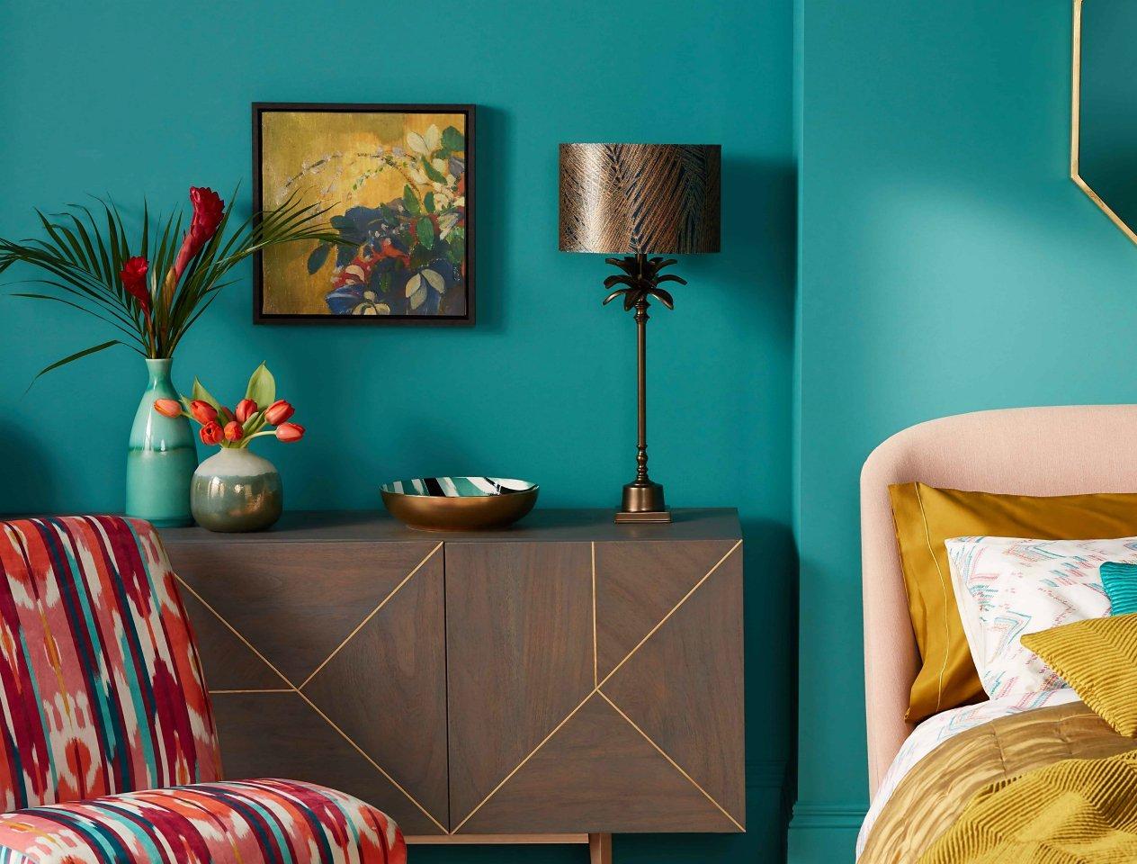
Keep it teal
Bold, jewel shades may seem like a leap if you’re currently surrounded by neutral walls, but you’ll get as much of a mood lift from Little Greene’s beautiful teal shade, Canton, as you would from a blast of colour. Use on walls and woodwork for immediate impact. Not feeling brave enough to paint a whole room? Try it on one wall to make a colour statement – the perfect backdrop for a gallery wall of your favourite framed snaps and pictures.
The Little Greene Paint Company, Canton (94)
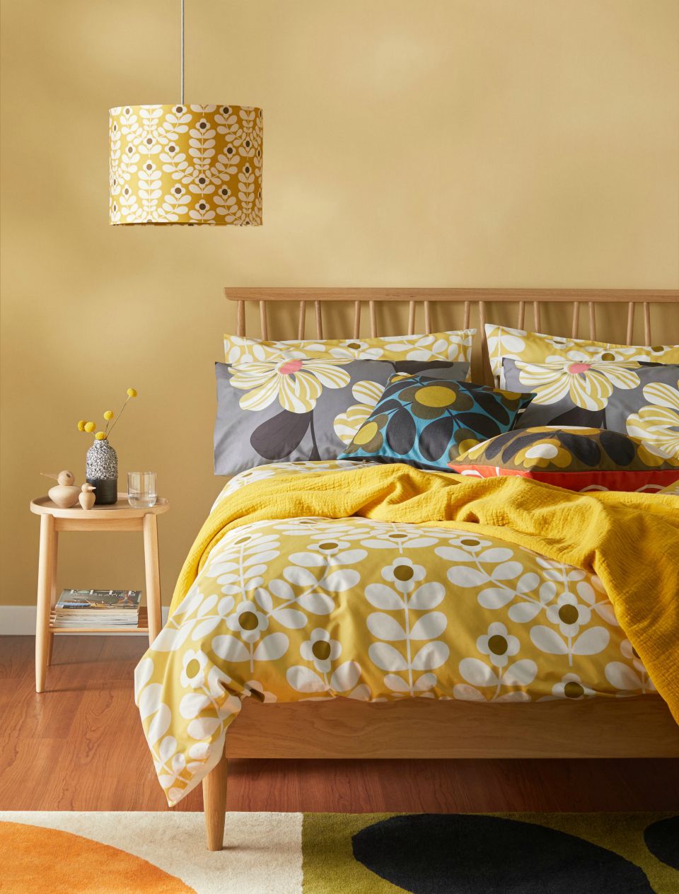
Mellow yellow
Oak Apple is a natural, uplifting shade, which sets off the blond Scandi-style wooden furniture and Orla Kiely prints in this bedroom beautifully. Ruth Mottershead, marketing director at Little Greene recommends: ‘For a bold contrast, select burnt orange furnishings or fabrics.’
And don’t limit it to the bedroom: ‘This tranquil shade works well in bathrooms to create a restful finish,’ she adds.
The Little Greene Paint Company, Oak Apple (63)
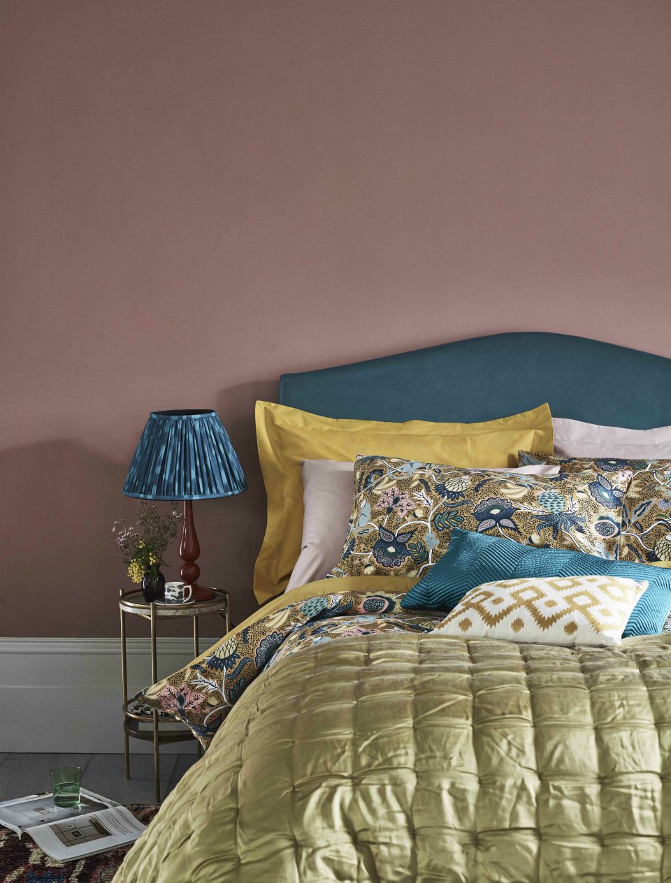
Soft pink
Soft pinks have become a new neutral in recent years and this soft, powdery hue called Ashes of Roses by Little Greene coordinates really well with a surprising kaleidoscope of different accent colours, and brings depth and warmth to a bedroom. ‘Pair with warm neutrals for an encompassing, comforting scheme,’ Ruth recommends. ‘Style alongside vibrant green accessories or an item of wooden furniture painted in “‘Citrine”.’
The Little Greene Paint Company, Ashes of Roses (6)
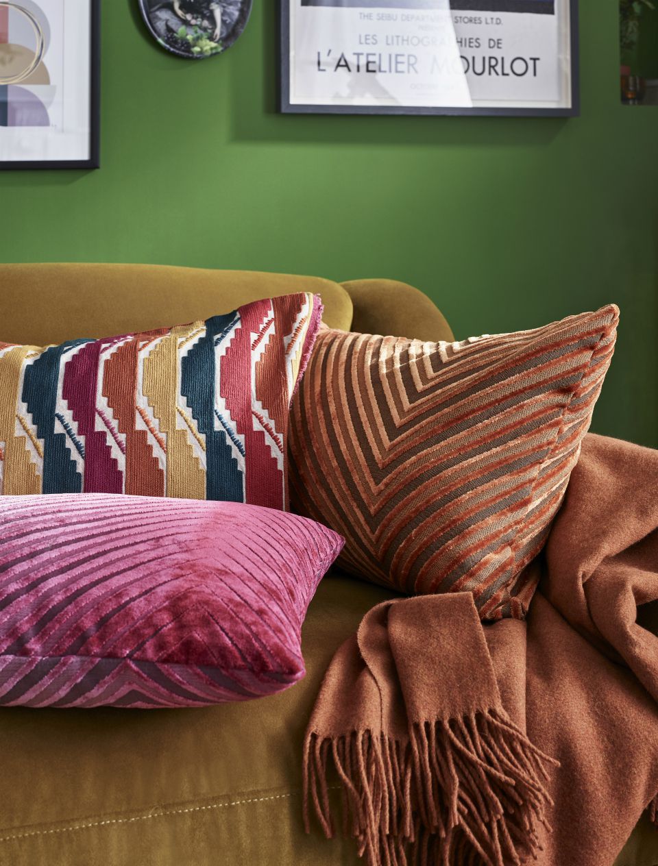
So fresh and so green
This brilliant, crisp green provided the setting for our Eclectics interiors collection this season. Ruth is also a fan: ‘Sage and Onions is the perfect bold green for an energetic entertaining or kitchen space.’ Be just as brave with your accent colours here – try golden ochres and terracotta orange – but if you’re after something more matchy, try pairing with green or turquoise furnishings for a coordinated finish.
The Little Greene Paint Company, Sage and Onions (288)
Moody aubergine
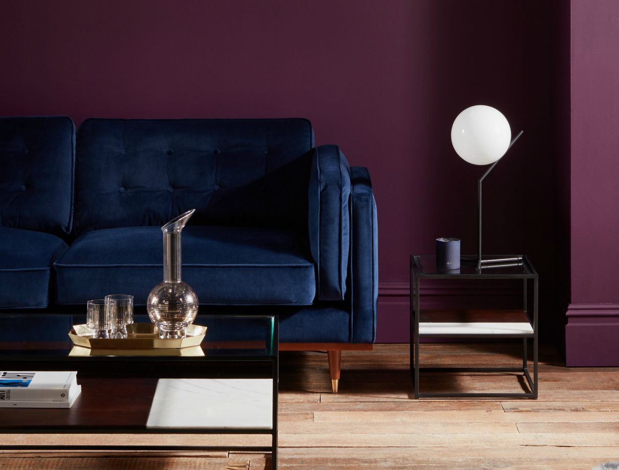
This delicious deep, aubergine colour is the one to try if you’ve been tempted to style it dark, but haven’t yet plucked up the courage. Pair it with Swoon’s lush blue velvet sofa and sophisticated brass accents. Follow our styling and go all the way down to the floor, painting the skirting boards for the full monochrome feel.
Dulux Trade 90RB 08/113

