OFTEN IMITATED, NEVER BETTERED. HOW HAS AESOP CEMENTED ITS PLACE IN BEAUTY FOLKLORE?
Established in Melbourne in 1987 by founder Dennis Paphitis, Aesop (the name is gently mocking the beauty industry’s penchant for exaggeration) was one of the original beauty disruptors.
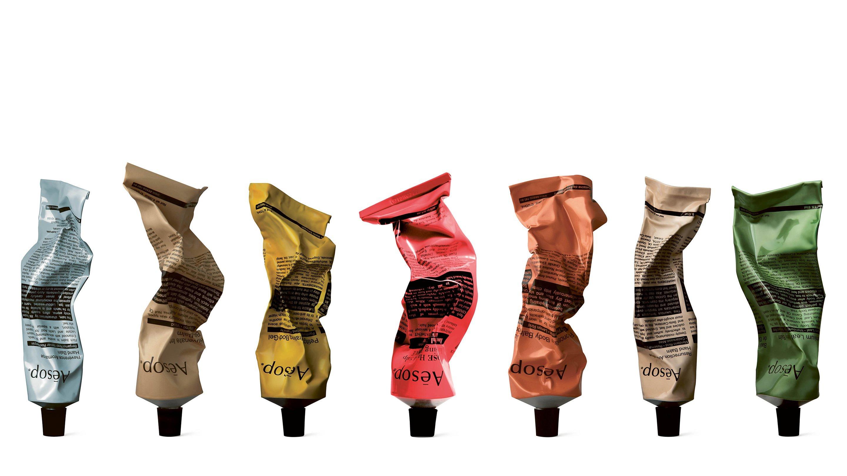
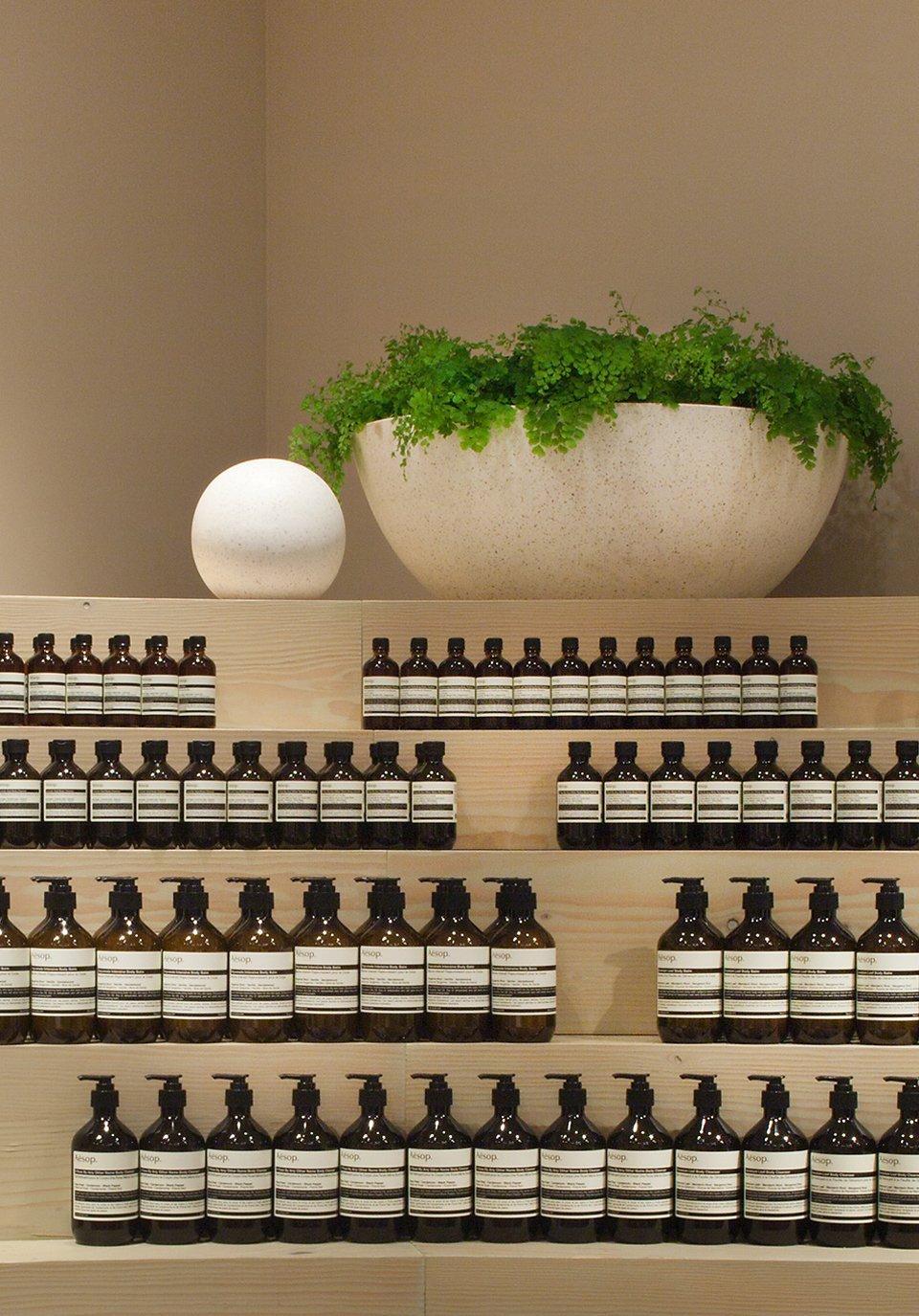
Way ahead of the curve, it was one of the first truly unisex, niche brands on the market with its homogenous brown bottles that were the antithesis of the flashy, gendered packaging of the late 80s. And yet somehow, it instantly became a mark of good taste.
Just like the cool kid at school who exudes effortless insouciance, Aesop gives the impression of not even trying. It has always marched to its own beat, with a non-conformist approach that eschews the traditional paths to beauty superstardom.
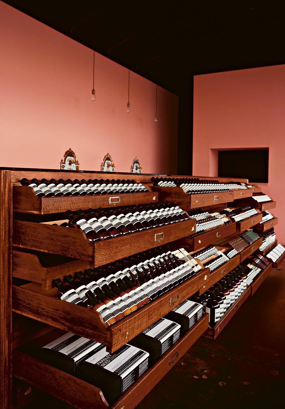
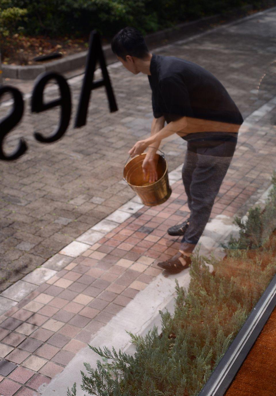
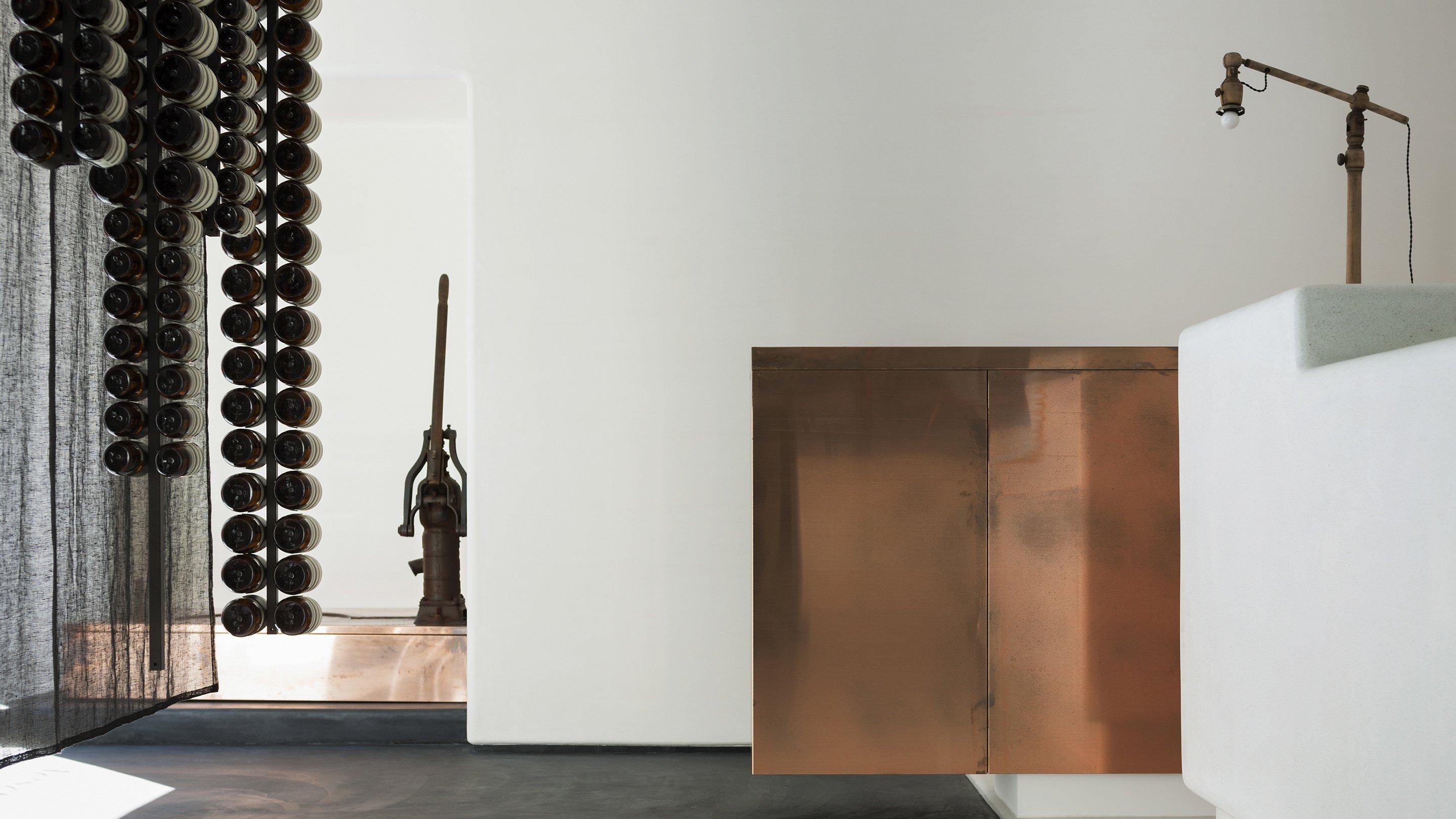
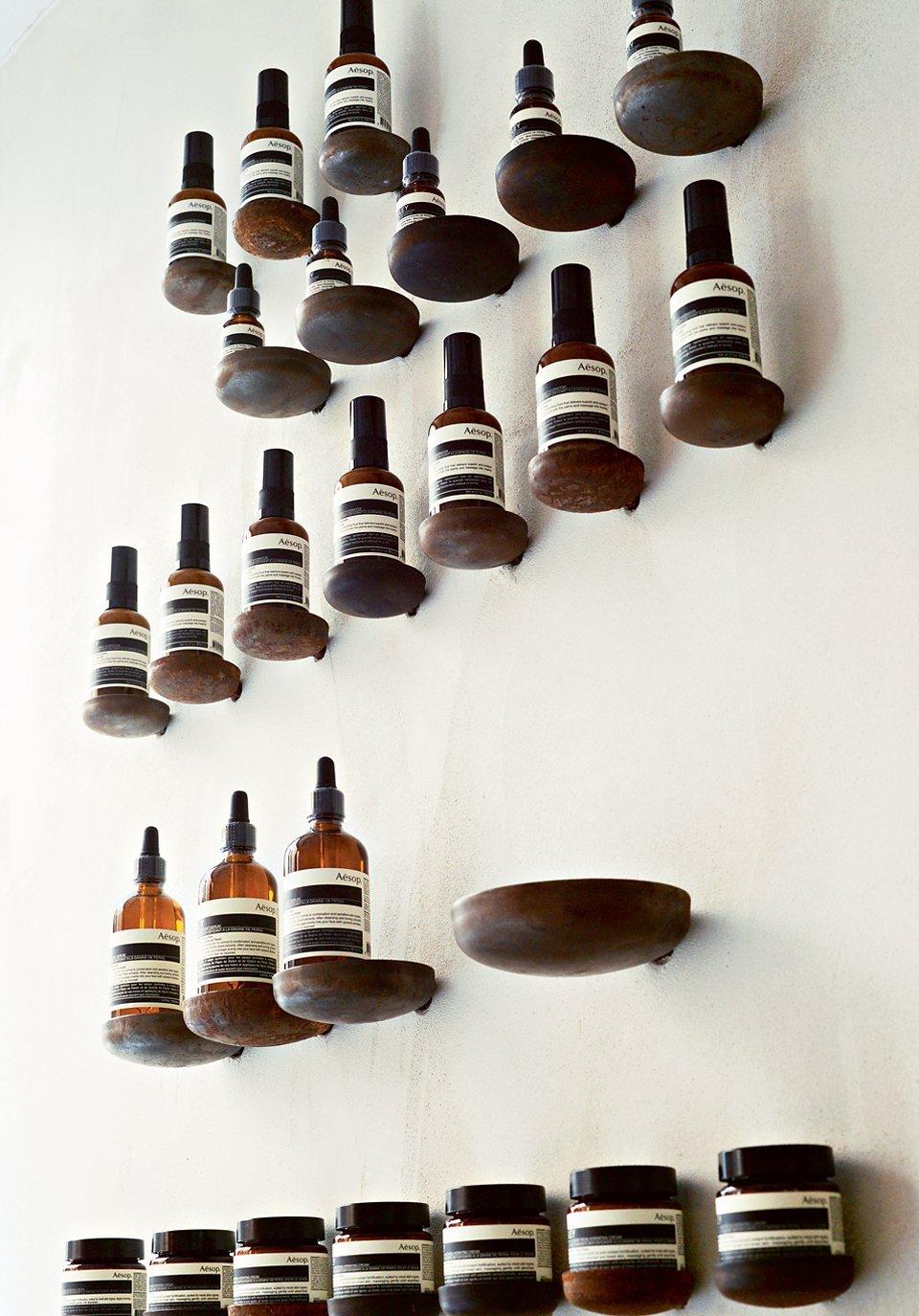
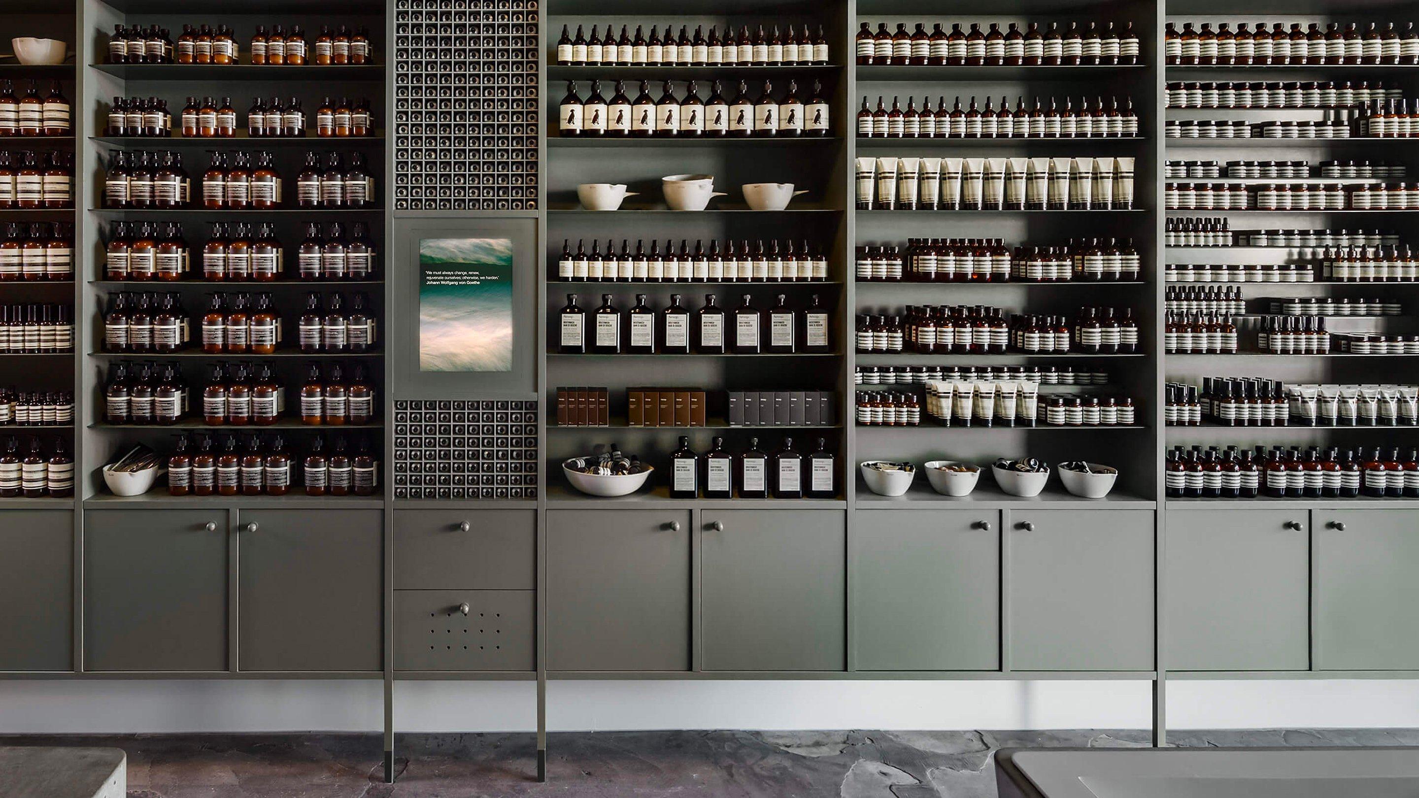
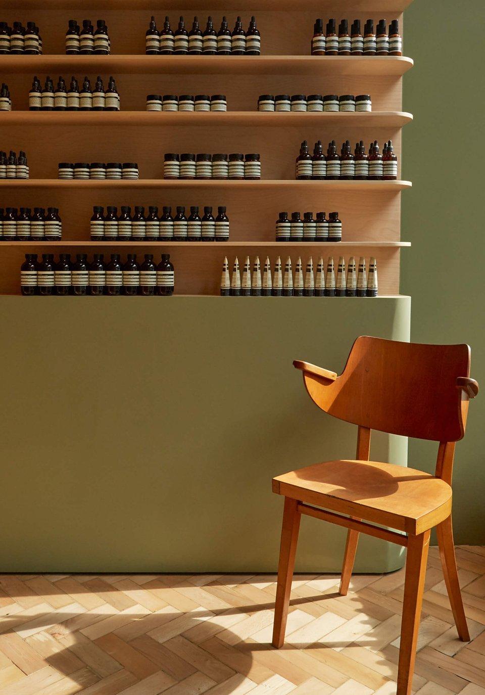
The Aesop shopping experience has also become the stuff of legend: a carpet of fallen leaves in select stores perfectly evokes the mood of autumn while the windows of the Nakameguro branch in Tokyo are washed each morning with hot water and eucalyptus oil for the olfactory pleasure of passersby.
But with legions of loyal fans, countless second-rate appropriations and an Instagram following of 618k and counting, it’s an approach that has stood the brand in good stead. So just how has Aesop achieved its iconic status?
1. Quality control
From day dot, Aesop has endeavoured to combine the finest ingredients in the most effective blends, created with an all-round sensory experience in mind. Despite using tons of beautiful botanicals, it doesn't call itself ‘natural’, instead preferring to celebrate the known scientific benefits of an ingredient, whether it’s an exceptional plant-based one or something man-made (jumping on bandwagons is for other brands). Similarly, there is no talk of ‘anti-ageing’ but a keen focus on skin health: ‘skincare doesn’t have to be complex – our philosophy is to care and protect and not to obsess.’
2. Timeless Style
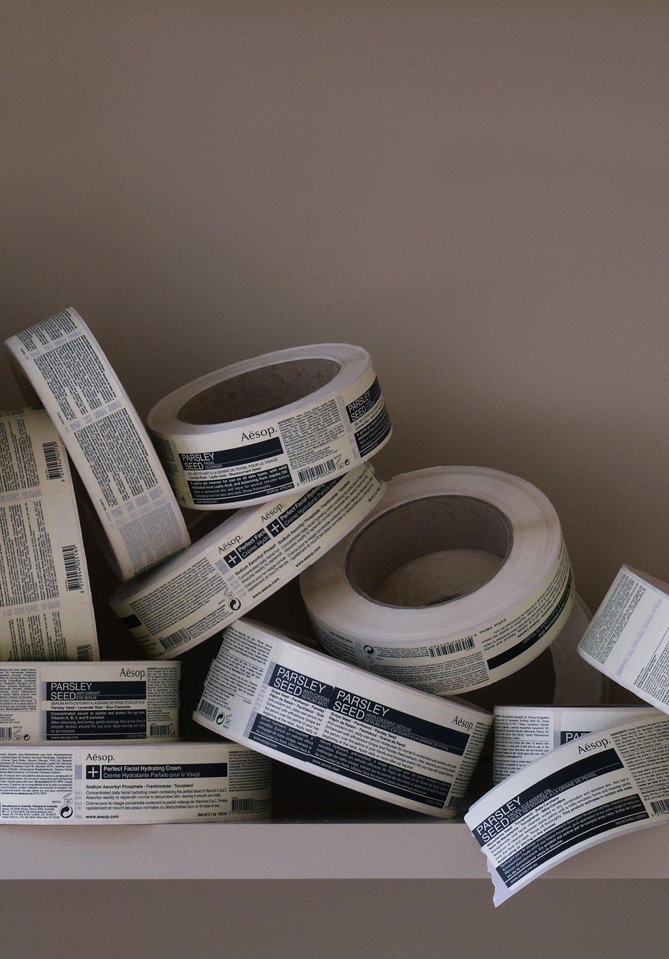
If imitation is the sincerest form of flattery then Aesop is due a hefty dollop of adulation. Utilitarian – and recyclable – amber-coloured bottles and monochrome labels with a clean, graphic typeface (design fans will recognise the fonts as Helvetica and Optima Medium) have become Aesop’s insignia. Chosen with the aim of eliminating visual clutter that might detract from the contents of the bottle, they led to the brand becoming a style icon at a time when skincare packaging tended towards the frou-frou and cellophane-wrapped boxes were the norm. These design codes have remained largely unchanged and continue to bring a sense of calm and order to bathrooms.
3. Future-Proofing
Aesop was advocating slow beauty and self-care long before either officially became ‘a thing’. It's this holistic view of beautifying, as well as the indie brand's embrace of the need to tread lightly on the Earth, that have safeguarded its future relevance. You won't find Aesop launching something it doesn't deem to be necessary, so it’s no surprise that its products often grace ‘best of’ lists or that some of them have taken up residence in the beauty hall of fame. Its most celebrated must-haves? The aromatic handwashes and balms which are the finishing touch to any bathroom makeover, the parsley seed skincare and, of course, the infamous Post-Poo Drops – a product only Aesop could make covetable.
4. Covetability
Some copycats may have earnt a little style kudos by mimicking Aesop’s hip typeface and minimal packaging but none have quite managed to capture its ‘je ne sais quoi’. It’s the unfathomable allure that ensures it continues to adorn the bathrooms of the most discerning, instantly upping a venue’s street cred and inspiring #shefies before the hashtag even existed. On our Aesop wishlist? Any of the themed gift kits which employ art and history to inform and stimulate as well as to beautify.

